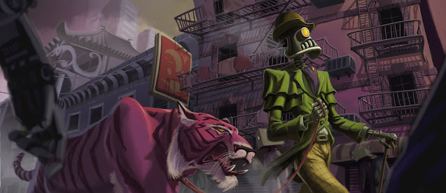
Here's the process of a piece I did called "Just walking the tiger", from the brainstorm to the final thing.
Brainstorming
I didn't really know what to do, so I started brainstorming with random words at first. The train of thought started with just words, then it shifted to sticking stuff together and when I got clearer idea of what I'd like to paint I just stopped and started a new possible idea. I thought of three possible things, and in the end I went with the first one.
Thumbs
After I chose what I wanted I just started doodling different points of view.
I really wanted a chinatown-esque feeling and an exaggerated perspective, so I decided to go with this one. Yep, pretty crappy doodles, but it was just to get the picture.
Layout
Here's a bigger version of that thumb. At first I wanted a realistic tiger and robot, but then I thought "mmmh, anybody who arrives at the idea of drawing a low view of a robot walking a tiger in chinatown will be able to draw/paint this", so to personalize it a bit more I decided to design and push a bit more the characters of the scene.
Design
So I started drawing and pushing and stylizing tigers from real tiger pics.
Same thing with robots, using some car references and 1920's clothing reference.
Painting process
I knew the background would be painful, so I had to really think it through and try to anticipate all the problems and solve them before hand. I enjoy characters the most, so I left them as the dessert. You can see a little pic of "The Goon" that I found after arriving to the concept down there, which I used as color and perspective reference.
This is the first pic with rough colors, based on the previous layout. Yeah, is kinda bad... The tiger is quite there design-wise, but the robot sucks. I realized that I only spent time designing its face and I didn't think of the body at all... but I had to attend the BG first to get it out of the way.
First I painted the building closer to the viewer and left the fire escapes for later, that's why they're so rough. The upper right light source defined the way I painted the tiles and decoration, and of course, the fire escape cast shadows later. I did a bit of cosmetic surgery to the robot, and it got better, but still far from complete.
There's a lot of painting done here from the previous pic. I already got the shape of the robot, a more saturated wardrobe to make it more focal, but I still had to deal with the buildings at the back. I usually have a "things to fix and remember" layer on top of the layer window, just to have in mind everything. It's also useful for writing new ideas or observations. The smaller the list gets, the closer you are to finish your illustration :)
You can see a lot of improvement here. Clearer folds in the clothes, more designed elements, better cast shadows on the main figures, the logo in the sign and some atmospheric perspective in the background. There're still a couple of details I had to attend. Made a bit cooler BG to push it back, the breath of the tiger, steam from the hot robot head, blurred the FG, some cast shadows and clothes hanging at the staircases, toned down robots walking in the background to make it a bit crowded and some cables.
Final Illustration
So here it is! The final thing. I think I spent over 35 hours in this one. I'm quite pleased with the result. I still want to fix some minor things, but the overall process is here, from the very terrible first sketch to the final painting.
Thanks for reading!
Saludos


No hay comentarios:
Publicar un comentario