jueves, 31 de enero de 2013

Creature Design


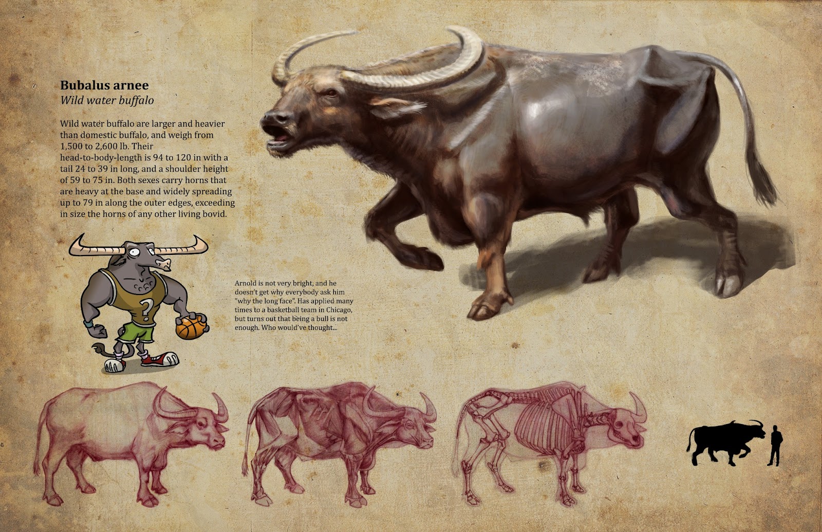
Some animals/creatures I did last semester. 


And the final one, that pleases me the most =)


Hope you like them!
Salúd!!

Woka

domingo, 6 de enero de 2013

Just walking the tiger

Hey guys!

Here's the process of a piece I did called "Just walking the tiger", from the brainstorm to the final thing. 

Brainstorming
I didn't really know what to do, so I started brainstorming with random words at first. The train of thought started with just words, then it shifted to sticking stuff together and when I got clearer idea of what I'd like to paint I just stopped and started a new possible idea. I thought of three possible things, and in the end I went with the first one.

Thumbs
After I chose what I wanted I just started doodling different points of view.


I really wanted a chinatown-esque feeling and an exaggerated perspective, so I decided to go with this one. Yep, pretty crappy doodles, but it was just to get the picture.


Layout
Here's a bigger version of that thumb. At first I wanted a realistic tiger and robot, but then I thought "mmmh, anybody who arrives at the idea of drawing a low view of a robot walking a tiger in chinatown will be able to draw/paint this", so to personalize it a bit more I decided to design and push a bit more the characters of the scene. 


Design
So I started drawing and pushing and stylizing tigers from real tiger pics.


Same thing with robots, using some car references and 1920's clothing reference.


Painting process
I knew the background would be painful, so I had to really think it through and try to anticipate all the problems and solve them before hand. I enjoy characters the most, so I left them as the dessert. You can see a little pic of "The Goon" that I found after arriving to the concept down there, which I used as color and perspective reference.

This is the first pic with rough colors, based on the previous layout. Yeah, is kinda bad... The tiger is quite there design-wise, but the robot sucks. I realized that I only spent time designing its face and I didn't think of the body at all... but I had to attend the BG first to get it out of the way.


First I painted the building closer to the viewer and left the fire escapes for later, that's why they're so rough. The upper right light source defined the way I painted the tiles and decoration, and of course, the fire escape cast shadows later. I did a bit of cosmetic surgery to the robot, and it got better, but still far from complete.


There's a lot of painting done here from the previous pic. I already got the shape of the robot, a more saturated wardrobe to make it more focal, but I still had to deal with the buildings at the back. I usually have a "things to fix and remember" layer on top of the layer window, just to have in mind everything. It's also useful for writing new ideas or observations. The smaller the list gets, the closer you are to finish your illustration :)


You can see a lot of improvement here. Clearer folds in the clothes, more designed elements, better cast shadows on the main figures, the logo in the sign and some atmospheric perspective in the background. There're still a couple of details I had to attend. Made a bit cooler BG to push it back, the breath of the tiger, steam from the hot robot head, blurred the FG, some cast shadows and clothes hanging at the staircases, toned down robots walking in the background to make it a bit crowded and some cables.


Final Illustration


So here it is! The final thing. I think I spent over 35 hours in this one. I'm quite pleased with the result. I still want to fix some minor things, but the overall process is here, from the very terrible first sketch to the final painting. 

Thanks for reading!

Saludos

viernes, 4 de enero de 2013

Visual Elements of story megapost!

I guess that I'm trying to make up the lack of posts with this one, so I'll upload most of my work for my Visual elements of story class =)

We had to re-create a classic, and I decided to give a little punk spin to Alice in Wonderland. The reason? Well, this'll be a bit of a confession here but:
- I read the book and GOD is she annoying
- I watched the movie and GOD is she annoying
- The imagery is incredible... but GOD is she annoying

So I thought "what would be the complete opposite?" And well... this is the result! 
I'll post here the research and result of four characters, props and some environments. Here we go!

CHARACTERS

Alice
Since she is the main character, I decided to develop her the most. From the initial thumbnail line-up I selected two possible final Alices, and then exchanged their shoes.

Thumbs
Narrowing it down
 Final Alice
 Turn around
 Expressions
 Poses
 Hands

Render


Queen of Hearts
I wanted her to be definitely different from the rest of the characters, that's why I went for the blockish one. The slender one looked too "Maleficent-like", but I still like it.

Thumbs
 Narrowing it down
 Final Queen of Hearts

White Rat
Since the story had this punk twist I thought it would be more fitting happening in a city, a sewer and a theme park for Wonderland, instead of a cottage house, a well and a forest. That's why I changed the white rabbit for a white rat. I like this design quite a bit.

Thumbs
 Narrowing it down
 Final White Rat
 White Rat study

Mad Hatter
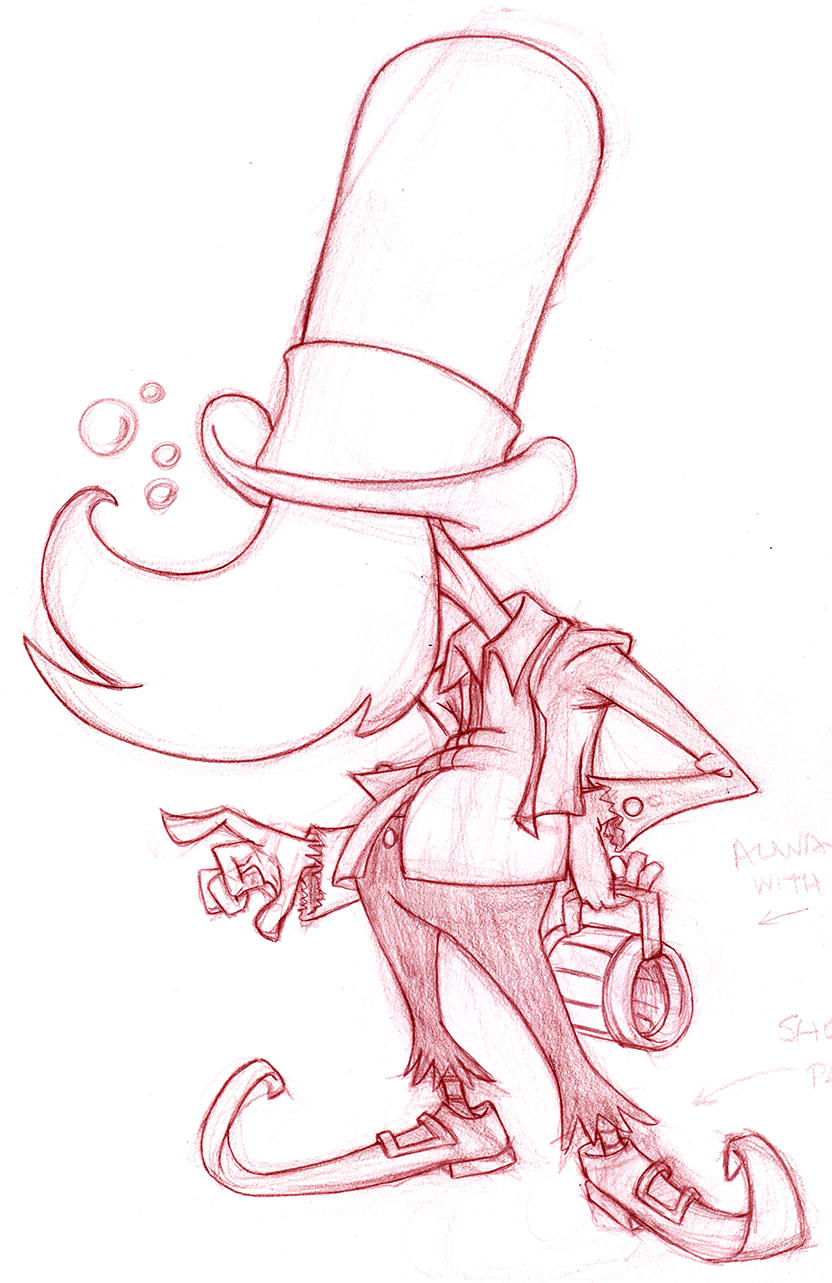
Same thing as the white Rat, since this is happening in a decaying place, I thought that a homeless drunk would be more fitting for the situation. I'm also very pleased with this design =)

Thumbs
Narrowing it down
 Final Mad Hatter

PROPS

Well, props! What else? This elements would be in this world. Theme-park related things, dead trees and other wonderland elements that could be inside this version of Alice. I don't usually draw this kinda things, but I have to confess that they were fun to draw.

Hot dog/ice-cream carts
 Buildings
 Cars 'n rides
 Props
 Dry trees

LAYOUTS


This was definitely the hardest part. What I do less, but strangely I did enjoyed it a lot, and to discover that I can actually do this kind of things was very encouraging to continue. I'm not including value studies or color studies just 'cause I don't lilke them that much. So here we go!

Thumbs
This thumbs briefly portray some highlights from the story and possible finished future layouts. For the finished ones I actually picked three thumbs. One remained quite faithful to the original idea (n°22) and the other one is a mix between number 7 and 25.


Wonderland
Alice grows and shrinks too much in the story, and I really wanted to do something with my urban-carnival-theme park wonderland. I went with complementary colors, only exagerating the highlights 'cause I thought it wold look better with they punky-ish story. In here I added several props I designed earlier.


The Trial
I made this one with tuscan red col-erase pencils. I love the look of a big drawing with traditional media, and it's been a long time since I did one to tell you the truth. That's why I decided to draw this first.


So, also complementary colors (red orange accent, desaturated blue green overall) for the mood and conveying a clear focal point, plus lots of environmental and linear perspective to give a sense of space. I think it works =)


Hah! Look at that. Four months of work in a nutshell.
Hope you like it guys!
I'll upload some creature design and digital painting later. And sketches also probably =)

Hope you had an awesome new year, and if you went through everything and read this: I love you. Really.

Saludos, terricolas!

jueves, 6 de septiembre de 2012

My little brother is getting married!

I'm cheating a bit with that statement, since I'm the oldest one of six... so technically they're all my little brothers and sisters, but what the hell, He's getting married!!


I designed and illustrated their wedding invitation, and it was actually super fun! I love them both so much, so at the beginning I thought it would be hard to turn them into a nice looking caricature... but they're both good-looking, so all I had to do is follow references and don't screw it up.

Tati is a chemist and my brother is a musician. Dirty Barry is with them also messing around... There are some minor details that I wanted to put in, such as the Gibson Les Paul, which is my favorite guitar model and is also the first electric guitar me and my brother held in our hands 'cause my dad owned one. It wasn't this color though (it was a cool looking black design with a white edge), I decided to change it for the illustration's sake.

The chord that Tati is making is also the essential chord for my band Renacimiento Mortuorio, my precarious metal band, and our singles "Demencia" and "Depresión" (without that chord the band would not exist). Why is this inside my brother's wedding invitation? Well, he and Tati are huge fans of my music (and they really shouldn't be), I played Depresión many times at the place they met, to the people surrounding the bonfire in Trailanqui, and also... I dunno, it made laugh!

The following drawings and sketches are some little surprises I put inside. 


 I will have some of my super best friends at the wedding party and some fun music, I'll be in Chile for a week and I don't know, it will be awesome!!!!!!! I'm just super super excited for everything =)

See you soon friends! Happy wedding dear Tati and Andrés!!!! This will be AWESOME!!!

Have a good one people of the world!!!