
I guess that I'm trying to make up the lack of posts with this one, so I'll upload most of my work for my Visual elements of story class =)
We had to re-create a classic, and I decided to give a little punk spin to Alice in Wonderland. The reason? Well, this'll be a bit of a confession here but:
We had to re-create a classic, and I decided to give a little punk spin to Alice in Wonderland. The reason? Well, this'll be a bit of a confession here but:
- I read the book and GOD is she annoying
- I watched the movie and GOD is she annoying
- The imagery is incredible... but GOD is she annoying
So I thought "what would be the complete opposite?" And well... this is the result!
I'll post here the research and result of four characters, props and some environments. Here we go!

CHARACTERS
Alice
Since she is the main character, I decided to develop her the most. From the initial thumbnail line-up I selected two possible final Alices, and then exchanged their shoes.
Thumbs


Render

Queen of Hearts
I wanted her to be definitely different from the rest of the characters, that's why I went for the blockish one. The slender one looked too "Maleficent-like", but I still like it.
Thumbs


White Rat
Since the story had this punk twist I thought it would be more fitting happening in a city, a sewer and a theme park for Wonderland, instead of a cottage house, a well and a forest. That's why I changed the white rabbit for a white rat. I like this design quite a bit.
Thumbs


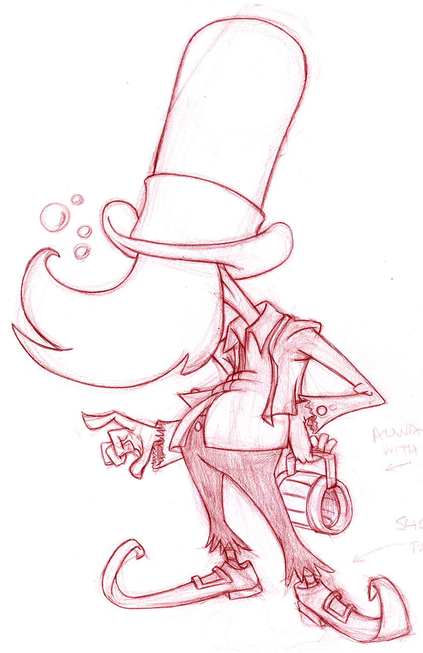
Mad Hatter
Same thing as the white Rat, since this is happening in a decaying place, I thought that a homeless drunk would be more fitting for the situation. I'm also very pleased with this design =)
Thumbs


PROPS
Well, props! What else? This elements would be in this world. Theme-park related things, dead trees and other wonderland elements that could be inside this version of Alice. I don't usually draw this kinda things, but I have to confess that they were fun to draw.
Hot dog/ice-cream carts


LAYOUTS
This was definitely the hardest part. What I do less, but strangely I did enjoyed it a lot, and to discover that I can actually do this kind of things was very encouraging to continue. I'm not including value studies or color studies just 'cause I don't lilke them that much. So here we go!
Thumbs
This thumbs briefly portray some highlights from the story and possible finished future layouts. For the finished ones I actually picked three thumbs. One remained quite faithful to the original idea (n°22) and the other one is a mix between number 7 and 25.

Wonderland
Alice grows and shrinks too much in the story, and I really wanted to do something with my urban-carnival-theme park wonderland. I went with complementary colors, only exagerating the highlights 'cause I thought it wold look better with they punky-ish story. In here I added several props I designed earlier.

The Trial
I made this one with tuscan red col-erase pencils. I love the look of a big drawing with traditional media, and it's been a long time since I did one to tell you the truth. That's why I decided to draw this first.

So, also complementary colors (red orange accent, desaturated blue green overall) for the mood and conveying a clear focal point, plus lots of environmental and linear perspective to give a sense of space. I think it works =)

Hah! Look at that. Four months of work in a nutshell.
Hope you like it guys!
I'll upload some creature design and digital painting later. And sketches also probably =)
Hope you had an awesome new year, and if you went through everything and read this: I love you. Really.
Saludos, terricolas!
No hay comentarios:
Publicar un comentario